Thursday, October 23, 2014

Colors by Llarowe Fall 2014 Collection Swatches & Review

Thursday, October 23, 2014
Hello everyone!

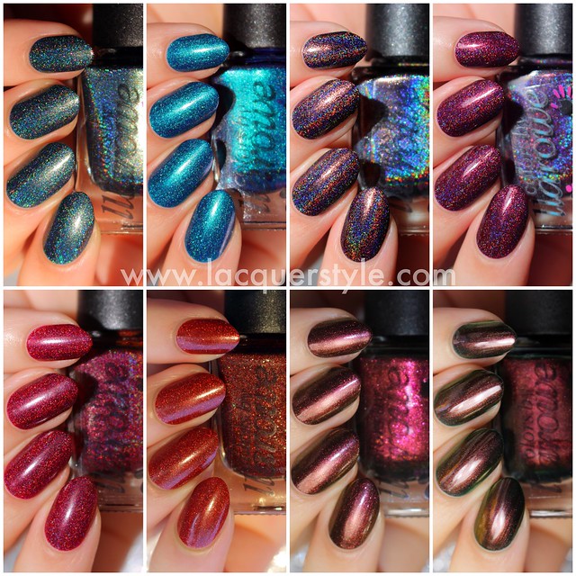
I've got swatches of eight of the new Colors by Llarowe Fall 2014 Collection to share with you today.  The restocks are today, at 12:00pm MDT and again at 7:00pm, so make sure you are ready if you want any of these gorgeous polishes!

Colors by Llarowe Fall 2014 Collection


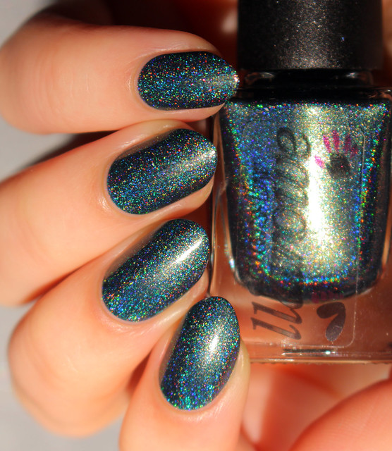
Seasons of Change is a beautiful dusty teal holo with a bunch of pink flake shimmer and a golden flash.  This is one of my favorites, for sure!  The formula was so smooth, opaque in two coats, and photographed without top coat.
IMG_6256-

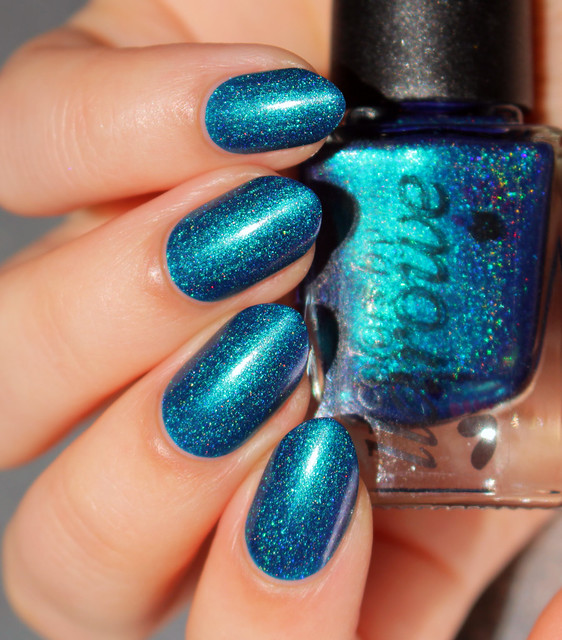
Sandy We Ain't In Kansas Anymore is a vivid blue holo with a turquoise duochrome and purple shimmer (which sadly, you can't see in my photo).  I love, love this one as well.  It's got more of a metallic finish to it than the others, and is one of those glowy polishes that appear slightly darkened at the edges.  The holographic effect is more subtle than the rest, and it's opaque in two coats.  This was photographed without top coat.
IMG_6193---

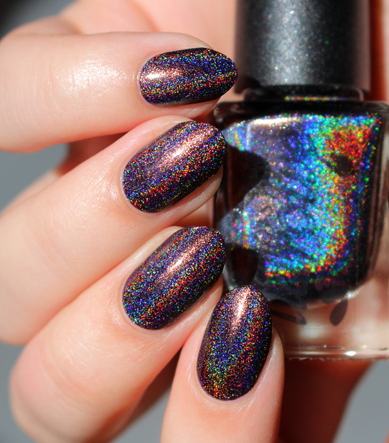
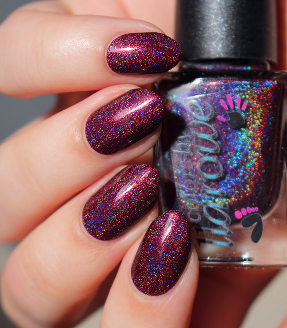
My Broken Down Crop Duster is a deep, muted purple (slightly charcoal) holo with a flash of golden shimmer.  Such a gorgeous fall color, and the holographic effect is extremely strong in this one, so it's amazing in the sun!  This one was also nearly opaque in one coat.
IMG_6019-

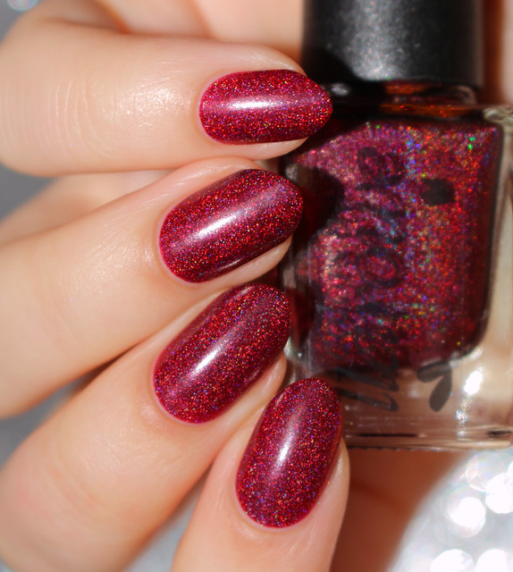
Mercy is a burgundy holo, which leans slightly more purple than red.  It's another beautiful color, perfect for fall.  It was also nearly opaque in one coat with a perfect formula, and the holographic effect is pretty strong.
IMG_6030-

Obsessed With Marilyn is a cranberry red holo.  This one is more of a jelly than the other holos, and the holo is less dense, more scattered, but it really glows from within.  So pretty!  It was opaque in two coats, and I photographed it without top coat as it dried quite shiny.
IMG_6082-

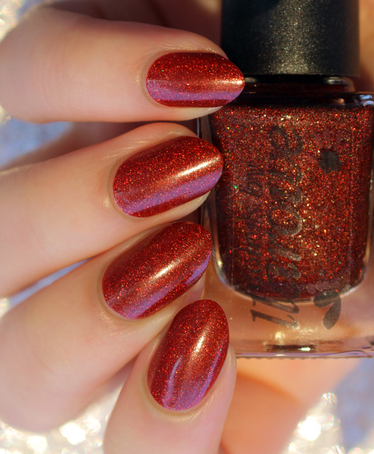
Penny For Your Thoughts is a burnt orange holo.  Like Obsessed With Marilyn, this one is more jelly than the other holos, with a less dense holo effect, but really glows.  It's such a lovely fall color and opaque in two coats.
Disclaimer: Unfortunately, this one stains pretty badly (bright yellowish stains), however, I scrubbed my nails with a toothbrush and my Arm & Hammer toothpaste, and about 90% of the stains came off.  I then lightly buffed after and they were gone.  You could also do a soak of lemon and baking soda.  You may want to avoid this one if that sounds like too much to handle though!
IMG_6307-

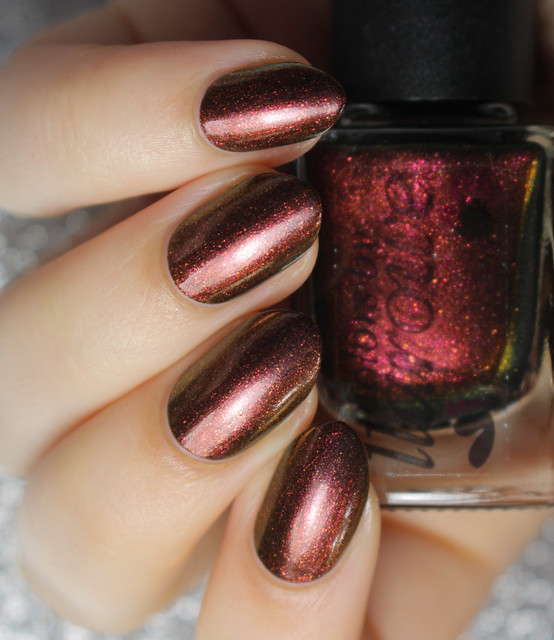
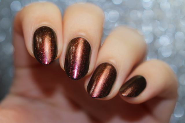
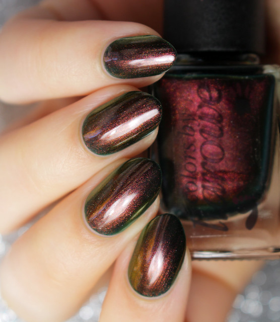
Burning Embers is a gorgeous, deep bronze with a stunning burgundy duochrome shimmer.  It shifts red, gold, and green and is packed with flakes and multicolored shimmer, so it's super sparkly!  Totally Fall appropriate, and has a perfect formula; opaque in two coats.  I'm not wearing top coat in the photos.
IMG_6349- 

IMG_6361-

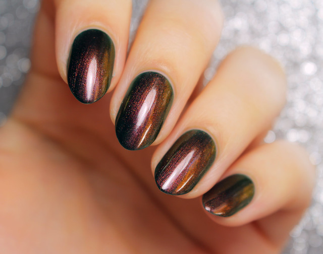
Sherwood Forest is a deep teal green jelly base, with red, orange, gold, blue, and green duochrome shimmer, as well as some multicolored shimmer that really shines in direct lighting.  This is another one of my favorites, and so Fall appropriate.  It was slightly sheer, so I used three thin coats for the photos, without top coat.

IMG_6236-

IMG_6244-


I hope you all enjoyed the swatches!  My picks are Sandy We Ain't In Kansas Anymore, Seasons of Change, and My Broken Down Crop Duster.  Make sure you head over to Llarowe if you've got your eye on any of these.  The first restock has now passed, but the second is at 7:00pm MDT!

You can also find more information about Colors by Llarowe here:
Instagram: http://instagram.com/colorsbyllarowe
Twitter: http://twitter.com/colorsbyllarowe
Facebook: http://facebook.com/colorsbyllarowe
CbL @ Harlow & Co: http://www.harlowandco.org/collections/colors-by-llarowe


Thank you for reading! :)


Kristin


Connect with me:
Instagram  |  Twitter  |  Facebook  |  Pinterest

Follow on Bloglovin


Tuesday, October 14, 2014

#WNAC2014 - October / Fall: Gradient

Tuesday, October 14, 2014
Hello everyone!

Friday was the second post for our Weekly Nail Art Challenge, and the theme was gradient.

IMG_5198-1

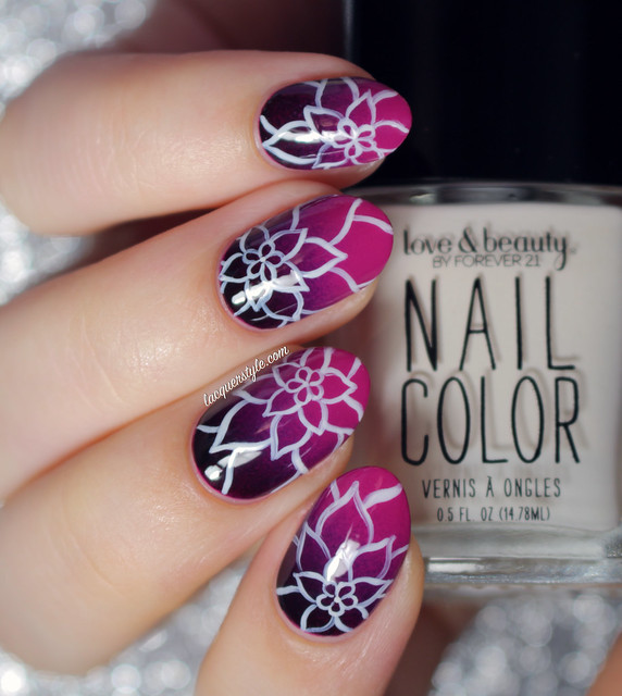
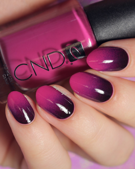
I love a good gradient base; it always makes my nail art that much more special, I think.  I was already wearing a really pretty magenta plum shade (CND Plumville), so I decided to just add a dark gradient on top to make it a bit more "Fall", using Julep Jodi and A England Lancelot.

IMG_5188-1 

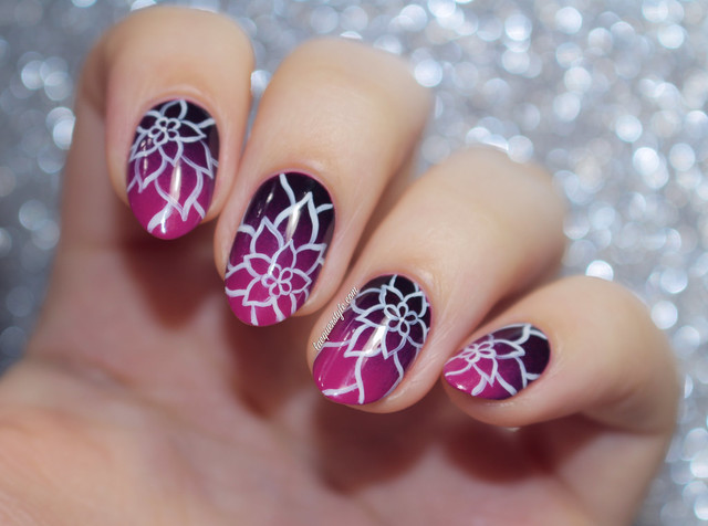
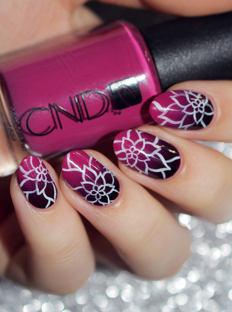
 I was really happy with the gradient, but of course I couldn't leave it alone, so I created a flower petal pattern using Love & Beauty (Forever 21) Ivory and my 18/0 Round brush from Michael’s.

IMG_5273-1

The design was sort of inspired by a leaf print I found last week on Pinterest, so that's where the idea came from, although I figured flower petals would be prettier with the base colors.

IMG_5276-1


I’m posting this a few days late (surprise, surprise), because I decided to film a tutorial for the design, so I hope you all enjoy it!


And here's a reminder of the challenge for the month, if you missed last weeks post:
#WNAC2014 - October: Fall


I hope you all enjoyed this post, and thank you for reading! :)

Kristin


Connect with me:
Instagram  |  Twitter  |  Facebook  |  Pinterest

Follow on Bloglovin


Friday, October 10, 2014

Colors by Llarowe I Love Candy Corn Halloween 2014 Swatches & Review

Friday, October 10, 2014
Hi everyone!

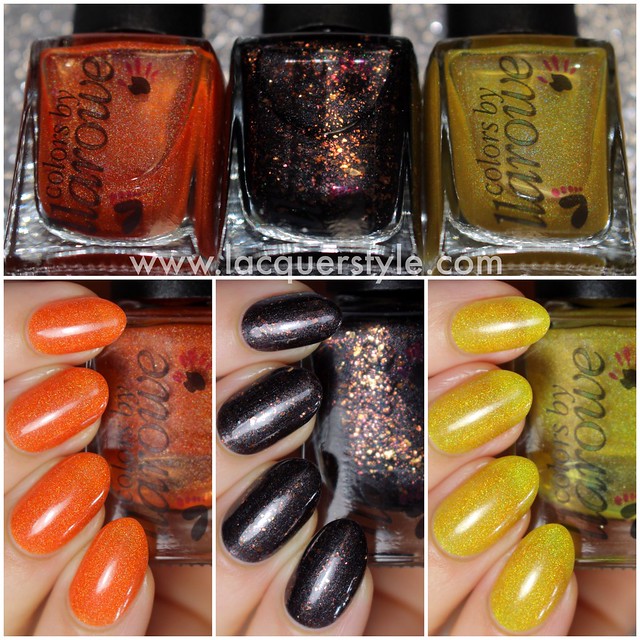
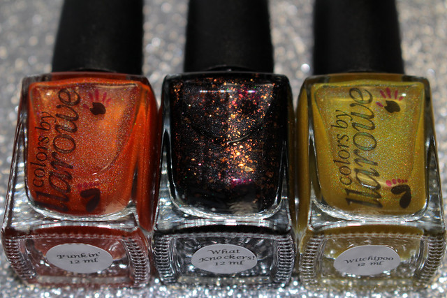
Colors by Llarowe has an amazing Halloween trio this year, which will restock today over on their shop.  I will be sharing my swatches of the collection with you today, which consists of two holographic jelly polishes, and a metallic polish packed with flakes.  I believe it's the final time this set will be available, so grab them if you can, before they're gone!

Colors by Llarowe Halloween 2014 Trio

IMG_5084-

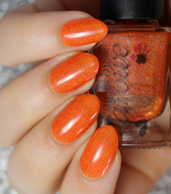
Punkin' is a pumpkin orange holographic jelly.  This is a really beautiful warm orange, with a great holographic effect.  Since it's a jelly, it's slightly sheer, but it covered well in two coats.  I am not wearing top coat in the photo below, as the jellies dried very shiny.
IMG_5041-

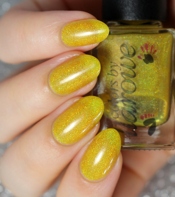
Witchipoo is a warm yellow holographic jelly.  I really love the effect and even the color of this one, but it's a bit sad on my long nails, because I have such a visible tips.  As you can tell, it's quite sheer; I had to apply four thin coats, and while the end result isn't too bad (and dried fast), four coats is a lot for it to still have such a visible line.  That said, I'm sure this is probably amazing on shorter nails, so keep that in mind.
IMG_5024-

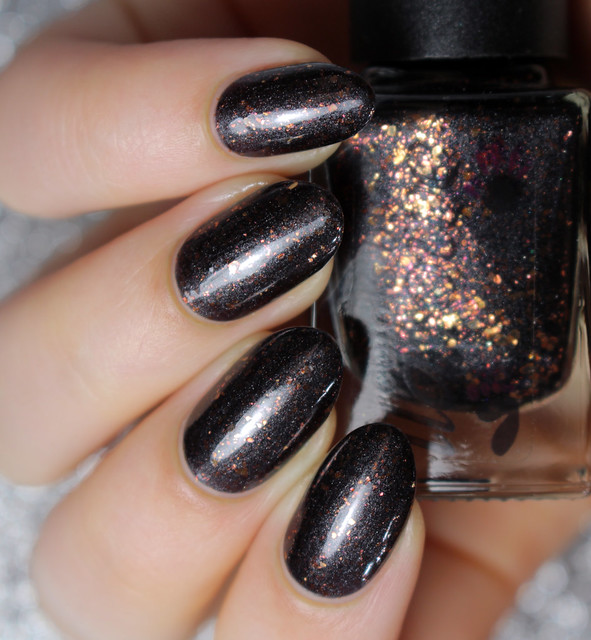
What Knockers! is a blackened charcoal metallic polish, packed with coppery orange flakes.  I saved the best for last, because this one is so awesome, and perfect for this time of year.  The flakes are so beautiful in person, and seem to almost shift a bit red in the light.  Just gorgeous.  I'm wearing two coats in the photo, and one coat of top coat smoothed it out really nicely.
IMG_5070-


The Colors by Llarowe Halloween 2014 Trio will be available today at 12:00pm MDT and again at 7:00pm MDT.  There will also be a preorder for their Fall 2014 collection (which is insanely gorgeous), and I should have my swatches up a bit later on today, so stay tuned!


I hope you all enjoyed the swatches, and thank you for reading! :)

Kristin


Connect with me:
Instagram  |  Twitter  |  Facebook  |  Pinterest

Follow on Bloglovin


Sunday, October 05, 2014

The Body Shop Colour Crush Nails Collection - Swatches & Review

Sunday, October 05, 2014
Hi everyone!

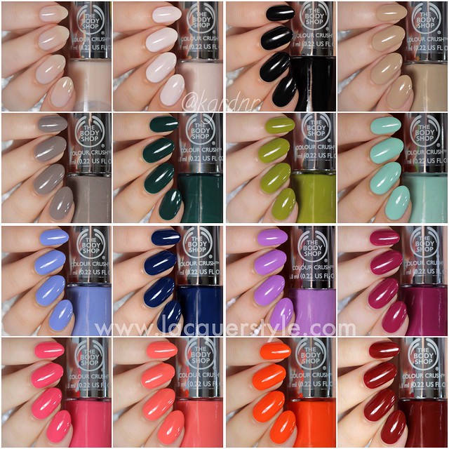
I’ve got swatches of The Body Shop’s new Colour Crush Nails Collection to share with you all today.  They are available in an amazing range of colours (24 shades!), 100% vegan without any nasty ingredients, and dry quickly to an extremely glossy finish.

A few other notes before I begin:  They are mostly creme - jelly consistency, which gives such a smooth application, so none of these are streaky at all (even the light shades).  They also have the most perfect, soft brush, which really helps the application.  I did not apply top coat on any of these either.  Anyways, let’s get on with the swatches!

The Body Shop Colour Crush Nails Collection

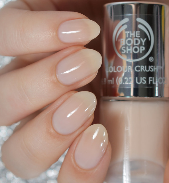
Pink Cream is a sheer nude jelly, not quite pink.  It’s actually very flattering, and even though I don’t wear shades like this often, you’ll most likely see this one on my nails for some negative space nails or other nail art designs.  It’s not streaky at all, so you can easily wear this at one, two, or three coats.  I applied three coats for the photos, just to see how opaque it would get.
IMG_4237-1

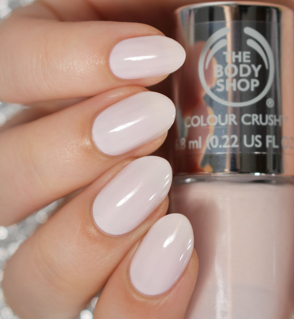
Frosting Fancy is an off white ballet pink creme.  There is a subtle shimmer in the bottle, but it does not appear on the nails.  This is one of my favorites of the selection I was sent.  The color is so gorgeous, and totally blows any other ballet pink shades I have out of the water.  It is again, completely streak-free and applied perfectly in two coats.
IMG_4249-1

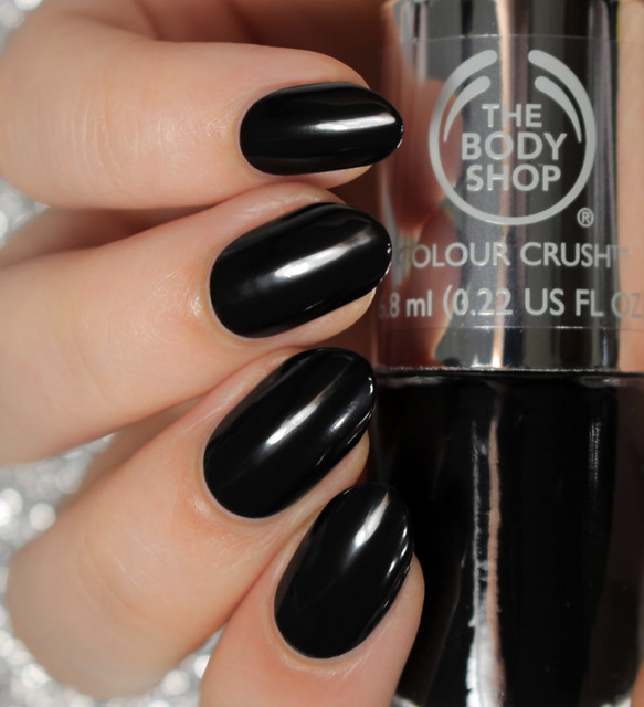
Smoky Rose is a pretty standard black creme.  It’ll be my new favorite black, I’m sure.  It’s nearly opaque in one coat; I applied one coat, and another swipe here or there where it didn’t completely cover for the photos.
IMG_4254-1

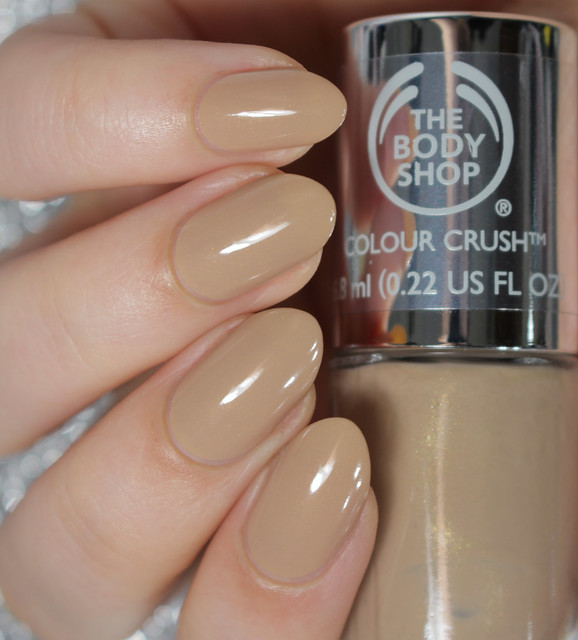
Almond Kiss is a camel nude creme with golden shimmer.  This is the only polish in the selection I was sent that has visible shimmer, and it’s beautiful.  Another perfect formula, opaque in two coats, super shiny, and I know I’ll be grabbing for this one often.
IMG_4260-1

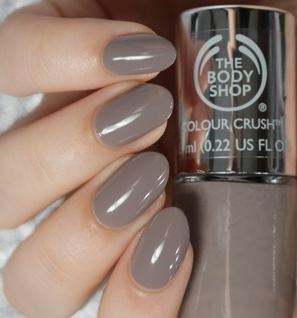
Gorgeous Grey is grey with a slight taupey brown undertone.  It’s almost more of a jelly formula, and looks a bit more mousey-taupe on the first coat.  It builds well, so it’s opaque in two coats.  Extremely shiny as well.
IMG_4265-1

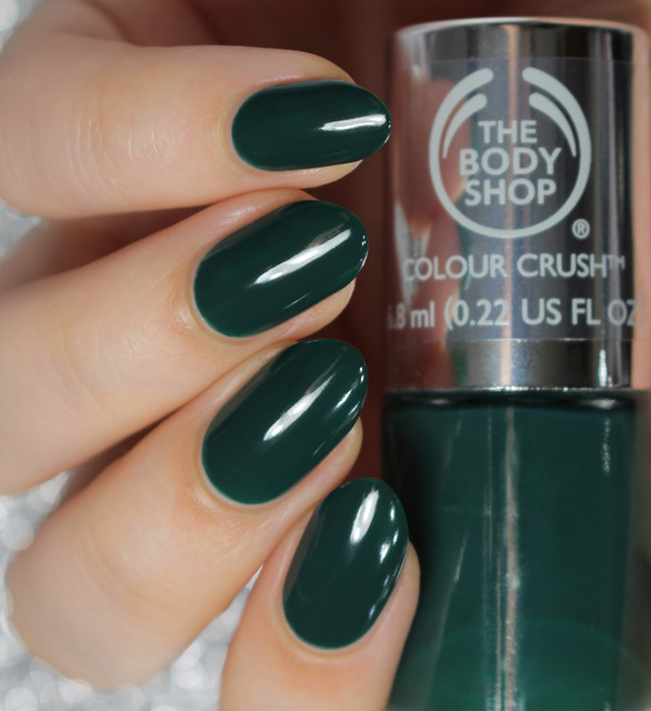
The Body Shop Green is a forest green jelly with a hint of teal in it.  It’s such a gorgeous green, especially for fall.  It is opaque in two coats, and super shiny like the others.
IMG_4275-1

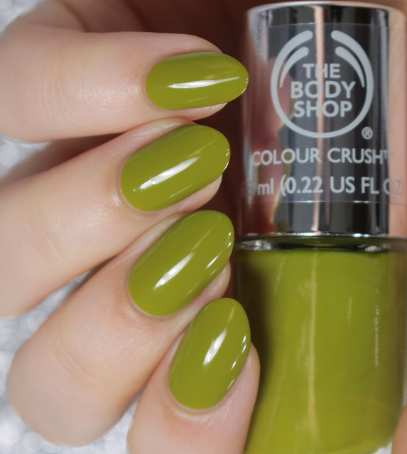
Hemp Over Heels is a chartreuse military green creme.  I happen to love strange shades like this, so this was one of the polishes I was most excited to try, and it did not dissapoint.  It is fully opaque in two coats, and has such a nice formula.
IMG_4283-1

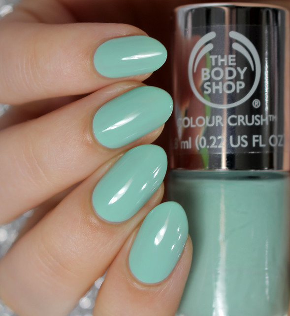
Mint Cream is a perfect mint creme.  It’s slightly more green than blue, as a mint should be, and it’s super flattering as well.  Another perfect formula, not streaky, opaque in two coats, and super shiny.
IMG_4284-1

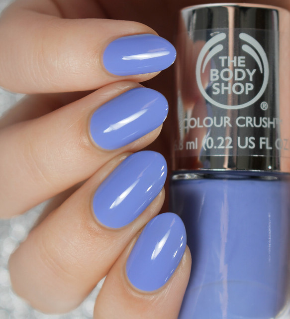
Got the Blues is a periwinkle creme.  This one is so beautiful, bright, and fun.  Opaque in two coats, and just perfect.
IMG_4290-1

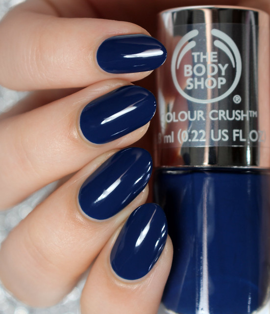
Crazy for Blue is a warm navy creme.  It’s a beautiful, dark navy blue, but it’s still bright enough that it doesn’t look black like many others.  Opaque in two coats, and it didn’t stain my nails when I removed it.
IMG_4291-1

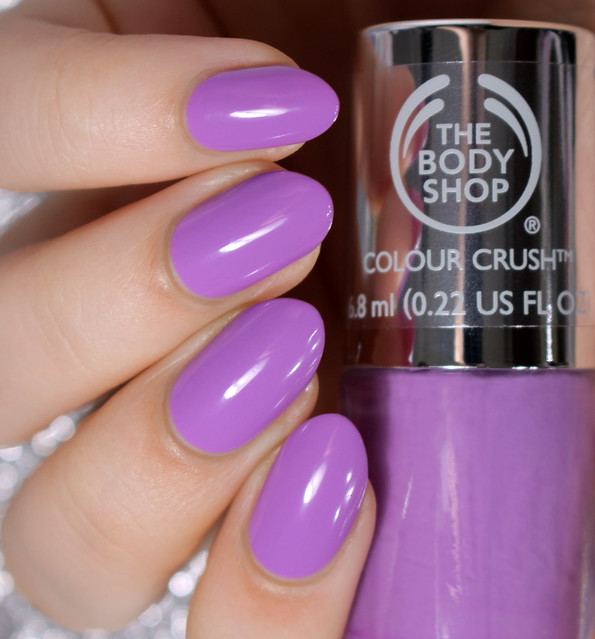
A Grape Affair is a bright purple creme.  It is more warm than cool toned, I would say.  It’s also opaque in two coats, and has a great formula.
IMG_4295-1

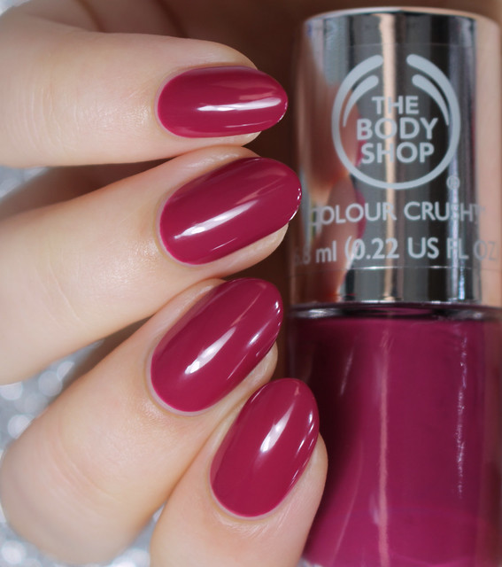
Deeply In Love is a perfect magenta plum.  It is the perfect mix of purple and red, and I would say this is a staple that everyone needs in their collection.  You could easily get away with one coat, but I applied two for the photos.
IMG_4310-1

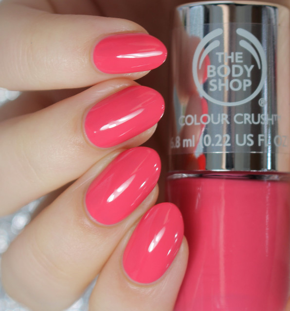
Cupid Pink is a wam pink creme.  Bright, and fun.  Slightly more jelly, which makes it super shiny, but it's still fully opaque in two coats.
IMG_4319-1

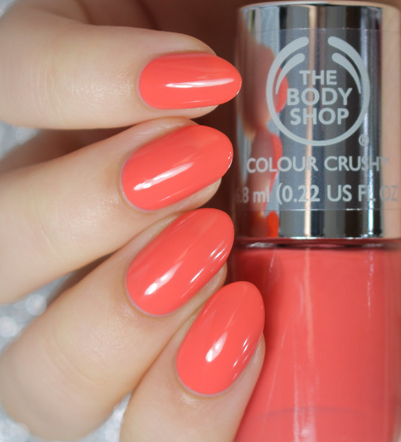
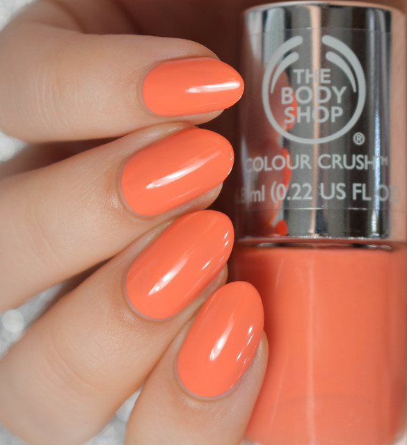
Rosy Cheeks is a bright coral creme.  It’s a really lovely, flattering shade, and extremely glossy.  Opaque in two coats as well.
IMG_4326-1

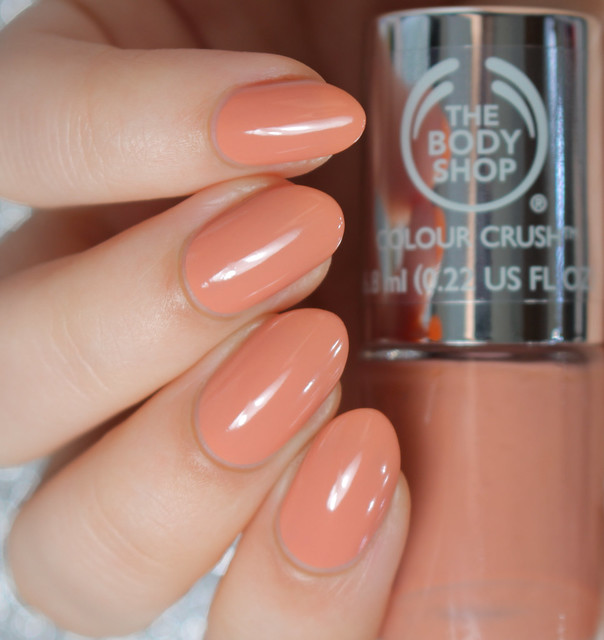
Meet Me At Dusk is a peachy nude creme.  I found this one so flattering on my warm skin, because of the peach undertone.  It was opaque in two coats, another great formula.
IMG_4335-1

Peach Babe is a bright peach creme.  It’s a lovely peach shade, and leans slightly more orange.  Not streaky, and opaque in two coats.
IMG_4340-1

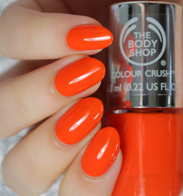
Just Peachy is a bright orange creme.  Another favorite of mine from the selection I was sent.  It’s absolutely perfect, and if you’re a lover of orange like me, you will need this one.  It’s slightly more jelly, but opaque in two coats, and extremely shiny.
IMG_4348-1

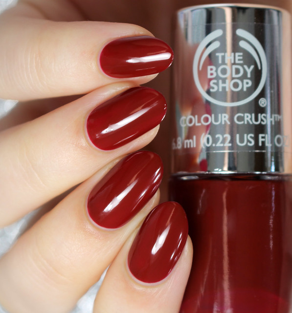
Crimson Kiss, is a deep burgundy jelly.  At one coat it looks slightly more purple toned which you could possibly get away with if you apply carefully, and at two coats the brown tones take over a bit more.  It’s a really nice fall color, which I’m sure I’ll wear a lot.
  IMG_4360-1

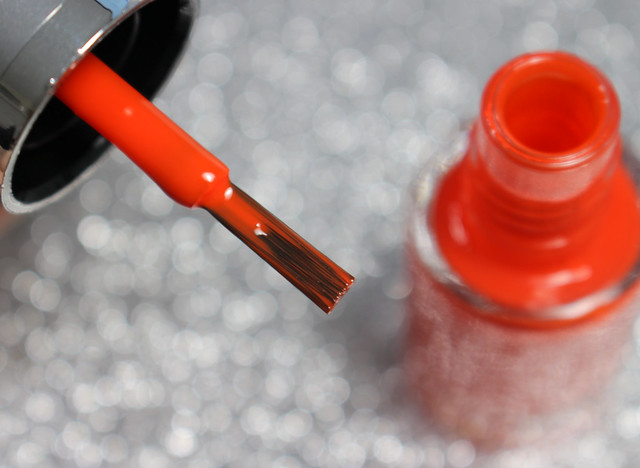
I wanted to share a photo of the brush as well.  It’s a really nice, fairly wide brush, and it’s super soft, so the polishes apply beautifully.

IMG_4355-


I hope you all enjoyed the swatches!  My favorites are Just Peachy, Deeply In Love, Mint Cream, The Body Shop Green, Almond Kiss, and Frosting Fancy.  This collection has really impressed me, and I can’t wait to get my hands on the shades I’m missing.

You should be able to find The Body Shop Colour Crush Nails Collection in stores now, and if not, then very soon, as they launch this month!  They retail for $6 each, which is great, considering the amazing quality as well.

Thank you all for reading! :)

Kristin


Connect with me:
Instagram  |  Twitter  |  Facebook  |  Pinterest

Follow on Bloglovin


Friday, October 03, 2014

#WNAC2014 - October / Fall: Leaves

Friday, October 03, 2014
Hello everyone!

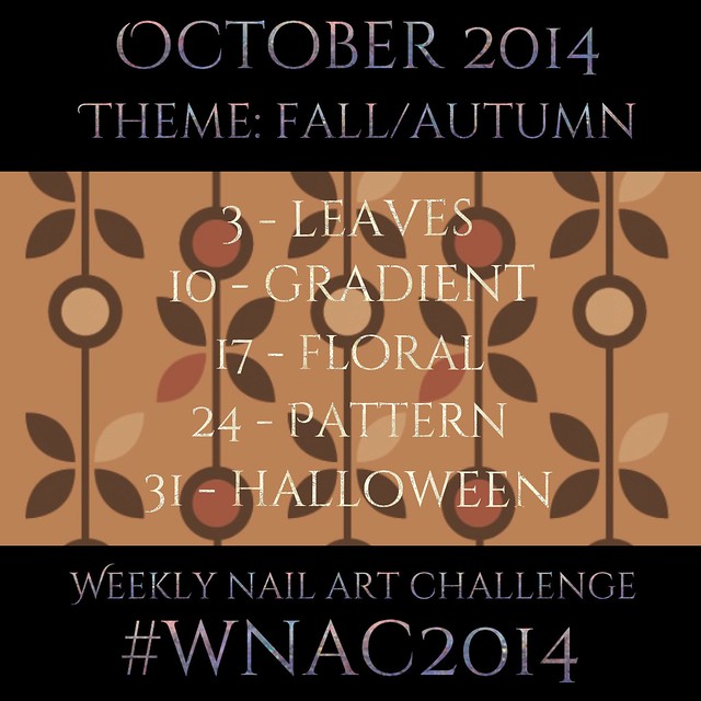
Today is the start of a new nail art challenge, that two fellow artists (@missbellatracey & Simply Nailogical) and I have come up with.  It is a weekly nail art challenge, which is much more manageable for me than the daily ones.  For October, the theme is of course Fall, and you're all welcome to join us in the challenge if you'd like.  You can check out the schedule down below, if you're interested!

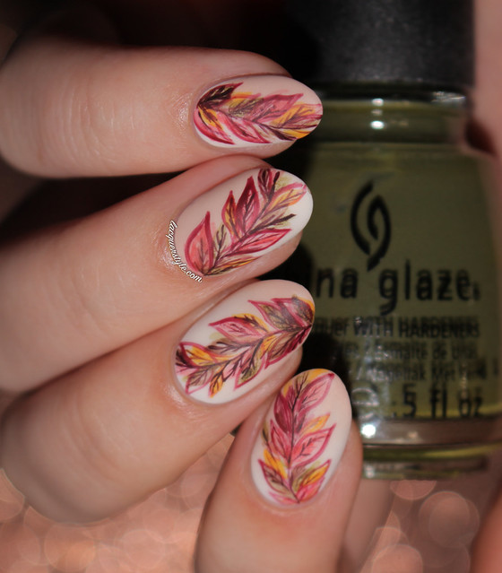
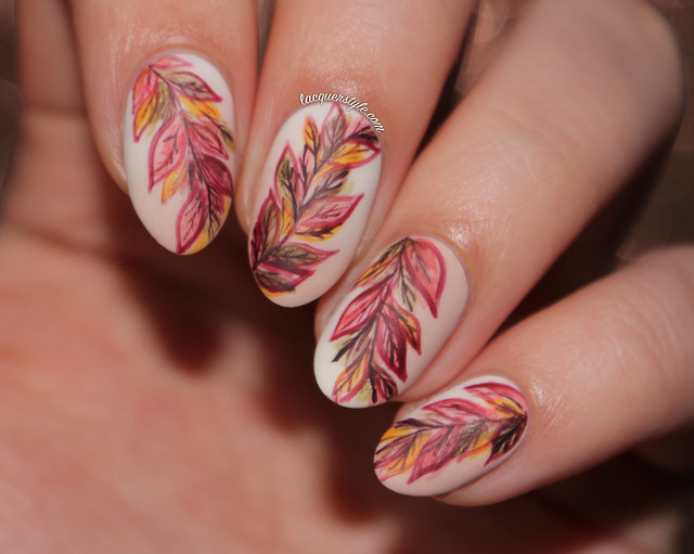
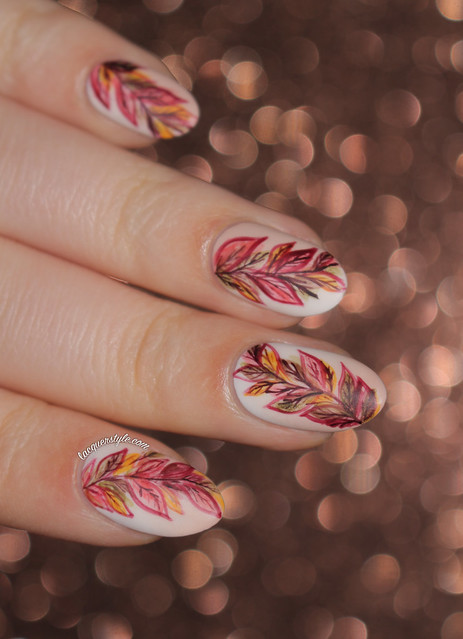
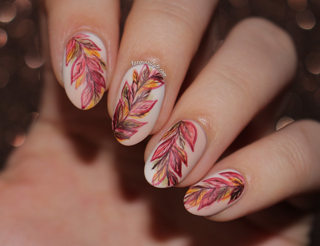
The first day is leaves, so I've created some artsy color changing leaves for today's nail art.

IMG_4208-1

I started with a subtle diagonal gradient using ivory and nude polish (Love & Beauty Ivory and Julep Pippa).  Then, with a "watercolor" technique similar to my video here, I created the base of the leaves in several different Fall colors (Square Hue Scorched Summer & Swahili Charm, China Glaze Westside Warrior, Julep Parker and Finger Paints Bauhaus Burgundy), and finally added the leaf details using a England Lancelot and my 18/0 Round brush from Michael's.

IMG_4216-1

IMG_4196-1

The gradient sadly got kind of washed out in the photos, but it was very noticeable in person.  I finished the design with JINsoon Matte Maker top coat, which created a really nice effect to the leafy details.

IMG_4195-1

Here's the October schedule for the Weekly Nail Art Challenge:

#WNAC2014 - October: Fall

I hope you all will join in with us in the challenge, and if you do, then I can't wait to see what you come up with!  I think it's going to be a great month for nail art; there will be new posts for each one (I promise this time!) and you might even get several new videos from me as well, so I'm excited!


Thank you for reading! :)

Kristin


Connect with me:
Instagram  |  Twitter  |  Facebook  |  Pinterest

Follow on Bloglovin

Lacquerstyle.com © 2014